Prototyping in terms of software development can be seen as a process of modeling concept of a software with some interaction. In some cases it could be totally different than final product but in general it is really helpful process because it gives developers / product owners better idea about what to expect from product and what can be improved. There is another term commonly used among web developers called Wireframing. It is same as software prototyping but it is specifically used for web sites.
As both of these things are very visual they give better idea about product and they are usually worked/reworked to improve final product. There are many many tools available for out of which Axure, Balsamiq and Expression Blend (which is part of Expression Studio Visual Studio 2012) are my favorite.
While back I was involved in a project where I was required to prepare initial concept of application design … it was very early stage of application designing and application itself was more of an idea than actual product. So I was required to create something very basic which gives an idea to developers and product owner how application could look like and how it will be interacted etc … as I had played with Expression Blend before so I ended up using it for my sample prototyping project.
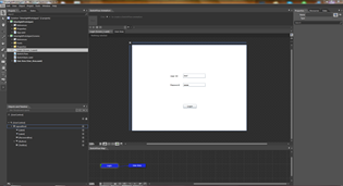
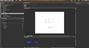
So in this post I probably give basic introduction to the tool of trade and in another post I will actually show to we can use Expression Blend addin Sketchflow to prepare prototype applications in Silverlight or WPF. I am using expression blend show the tool but it has met end of lifecycle and MSFT has integrated it into Visual Studio 2012 but usability vise you probably will not see any difference at all. I personally still prefer to use Expression Blend over Visual Studio because it loads faster and is less resource hungry ![]() . If you look at screenshots below you will notice that both Blend for VS 2012 and Expression Blend 4 looks almost same.
. If you look at screenshots below you will notice that both Blend for VS 2012 and Expression Blend 4 looks almost same.
 |
 |
There are few common places that will be used the most while creating prototype.
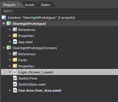
First you will see is "Projects” tab, it shows projects listed in your current solution. If you have used Visual Studio ever then you will find this tab very familiar.
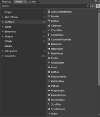
Next tab to Projects is “Assets” tab, it holds all assets that can be used for designing. Think of it is a toolbox in Visual Studio which holds all controls.
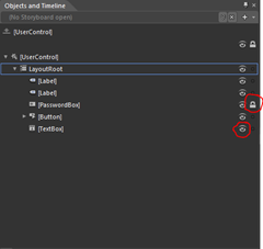
Another useful section is Objects and Timeline, I am not using Expression Blend as Sliverlight development tool I use is rather as designing tool so I mostly use it to explore objects and quickly access their properties for configuration. But in details it can be used to modify objects, setting colors brushes masks etc and create animation timelines for animation (more about it in future post …. may be ![]() ). If you look at screenshot below I have used LOCK to lock password textbox so that it cant be edited or moved. Also there is another option with eye like symbol which allows developers to toggle visibility of that object both of these features are pretty useful when designing layout
). If you look at screenshot below I have used LOCK to lock password textbox so that it cant be edited or moved. Also there is another option with eye like symbol which allows developers to toggle visibility of that object both of these features are pretty useful when designing layout
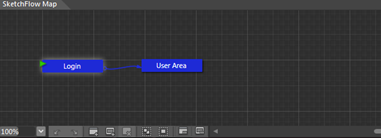
Next is Sketchflow Map it is right below main work area, while prototyping this area is used to create screens weather it be a new screen, duplicate screen or a connected screen. It gives visual idea to both developers and end users about flow of information in form of blocks. For example in a demo that I am preparing for this post has two screens and shows how they are connected with each other.
Another one of the most useful area is “Property” pane. As you can guess, it shows property for currently selected object. And it allows easy modification from that. For example in screenshot below, I have selected textbox and it shows different properties of it.
In the property pane there is another sub-property (!!) pane exists which is called Events, and it contain all events available for that control. It is same as event you will see in Visual Studio for any object. For example in the screenshot included below you can see different properties of Button.
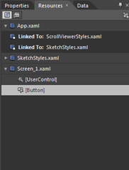
Another useful pane is “Resources”, it is located right next to Properties pane. It contains all styles used by this project and from here you can add-remove-modify style of any object.
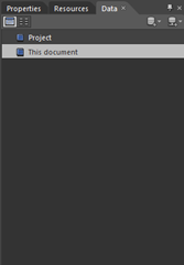
Next tab to Resources is “Data” pane and as name suggest it contains information of data sources used by project. Actually Expression Blend has really great feature to generate mockup data with very less troubles but about that in some other post.
One last area that I have not explored much (because I am not very good at it too ![]() ) is Sketchflow Animation. It allows devs to create animation.
) is Sketchflow Animation. It allows devs to create animation.
And with this I will end this post. In next post I will be showing how you can create Prototype Application for mockup.
It’s Just A Thought … ![]()

