In SQL Server 2008 R2 Microsoft introduced really cool new feature … MAPS. With that user can use their existing data on top of maps to have better visualization of information (say customer base distributed across USA). What’s really good about this feature is user can use maps from maps gallery, or spatial data or ESRI (Environmental System Research Institute) shape files, hell you can even add bing maps background on top of it ! In short I think maps add one more tool in BI arsenal ![]()
For this demo, I have used VS 2010 and SQL Server 2012 for generating map report. I have my little table based on AdventureWorks 2012 which I am using as data source for this report. First step is create new report project in VS. And add new report, create new database connection (for data source) and a query (for data set).
 select StateProvinceCode,count(1) as TotalCustomers from tablebar
            where countryregioncode = 'US' group by StateProvinceCode  order by StateProvinceCode
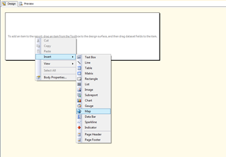
My above query gets count of customers per state and sorted by state. So this report basically shows count of customers located in each state of USA. Once that is done, its time to design the report. All you need is to drop map control in empty report area. As soon as you drop map control in report, it will start layer wizard. This wizard is used to set different settings of map, like map type, data source for map, layout etc.
 |
 |
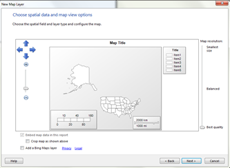 |
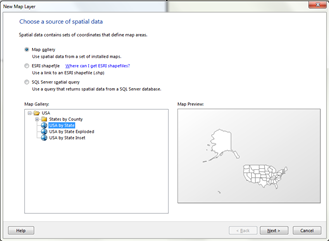
First step is to select source to be used for maps. For this demo I am using map gallery and USA by States option. Alternatively I have option to use ESRI shape files or geo spatial data from SQL Server. Click on next, and this screen will show how report will show all states, you can zoom them crop image, set quality of image. Once satisfied, click on next.
 |
 |
 |
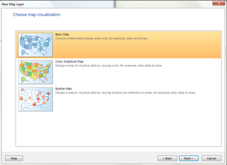
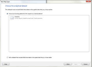
Next step is an option to select type of data visualization. Here user has 3 option, Basic map, Analytical Map or Bubble Map. Each visualization is used for specific purposes. And here our purpose is to show distribution of customer base in the USA. So I selected, second option Color Analytical Map. Next screen is to select datasource for report, which we have created in very beginning.
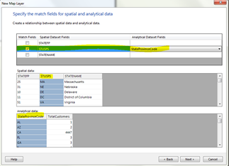
Next step is to map field from data set and spatial data from map for analysis. To have some sort of analysis, you will need to have any of following spatial data. State number, State Code used by USPS or State Name. Here in my dataset, query returns codes of states so I selected “STUSPS” & mapped it with stateprovincecode from my dataset. As an indication of mapping of fields both of fields will be highlighted.
 |
 |
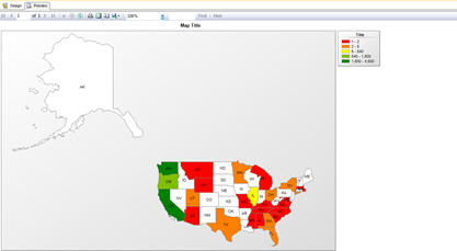 |
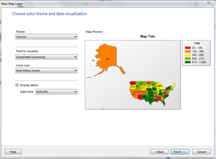
Next step is to choose theme and data visualization. I want to see total customer counts per state, thus it is set in “Field to Visualize”. I wanted to show state with highest number in green and lowest with red, so I have to select color rule to “Red-Yellow-Green”. Also, I wanted to display state codes on each state to make things more understandable, so I have set data field to STUSPS.
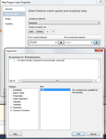
For some reasons, AdventureWorks 2012 database contains empty spaces in name of each states, so above setup doesn’t work properly. And to overcome this issue I had to remove whitespaces in records. For that I have to select “Layer Data” which opens up “Layer Data Properties” window. In that, go to “Analytical Data” tab and select create an expression where STUSPS is selected in Analytical dataset and replace it with expression,
= trim (Fields!StateProvinceCode.Value)
Once that is done, click on preview. And voila, you should see customer distribution across the USA as an analytical map. And from it looks like there are number states where we can expand our business !! And we need more customers in states with RED color.
I know it is very simple demo, but idea here is just to show power of maps in SSRS and insight it can provide in terms of BI.
That’s it for now. I have uploaded project here.
It’s Just A Thought … ![]()
